The corporate identity of IBEC was conceptualized by founding director Josep A. Planell in 2005 to encapsulate life, technology and vibrancy.
The green of IBEC signifies the olive tree, which takes fifteen years to mature and bear fruit; that’s the same amount of time it takes to educate a human to adulthood. After it matures, the olive continues to yield fruit for decades and sometimes even centuries – just as the discoveries of our scientists will make a difference for centuries into the future.
IBEC’s new logo came into force in January 2015. In this section your can download the logo in various formats as well as official templates and other documents, and a guide to the corporate colours and usage of the logo.
| IBEC logo
| Logo for dark background
| Corporate identity manual
| Scientific poster (A0)
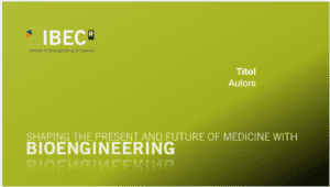
| Powerpoint presentation

Corporate identity manual This manual contains information about the correct usage of the IBEC brand and official colours. | Please contact the communications department ibeccommunications@ibecbarcelona.eu if you need more information. |